
Thomas Lanaux was born in Metairie, Louisiana, and was raised in the New Orleans area and Tennessee. He later finished high school in Mandeville, Louisiana. Having studied Art in high school, he enrolled in the Fine Art department at Southeastern Louisiana University. Curious of the nature of design, typography and graphic images he continued on to Louisiana State University to study Graphic Design in 1988. Upon completion of his bachelor's degree, Thomas decided graphics alone could not satisfy his curiosity in inventing stories and images, so San Francisco was the next destination. The Academy of Art College in the heart of the city became the springboard for a merging of many talents all together.The Bay Area's environment of creative minds all concentrated in such a small area proved to be the perfect inspiration. After the final MFA showing of his series "The Musicians of Jazz" in February 1995, Thomas set a goal to continue the series, outside of the school's parameters. His drive was now to meet musicians, djs (of all styles), producers and other artists in hopes of piecing together clues as to the future of the burgeoning series.
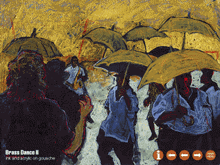
The best step Thomas says he took was to start researching music festivals. The grandaddy of them all is, of course, the Louisiana Jazz & Heritage Festival which opens around the end of April and beginning of May each year. His first "official" visit was in 1994, when he sketched live performances and photographed images he felt would make for good paintings. He has already created many illustrations from these photos, which have formed the beginning of his newest series "Brass Dance" (featured on the Galactic cd Coolin Off). The name refers to New Orleans' marching brass bands, and the "second liners" who follow just behind the musicians. Having spent his formative years in and around the state, Thomas has a personal passion for these people, their rich heritage and customs. "One just cannot find this kind of personal involvement in many other places. People don't question whether or not they should get up and shake their body to the music, with a huge plate of Jambalaya in one hand and a cold drink in the other. They will pick up whatever they have and just dance until the music stops. Each band has its own trademark colors or design on their uniforms and umbrellas. So watching this dance is a level above entertainment, it is truly still holding on strong to its ceremonial roots! To me, it is just like watching a painting in live action, with all the colorful costumes glittering, canes and umbrellas waving all around and whistles blowing in between the beats." Thomas says the Jazz Fest is only the beginning. He hopes to travel the world searching out new festivals of related music and hot spots for jazz and its related styles.
Thomas Lanaux's paintings are also inspired from jazz album cover designs from the 1950's and 1960's, in which designers were limited with not only their budgets but also in technology. The beauty Thomas sees in these older covers was not their details or color activity, but the lack of it. Designers were forced to think more creatively within the limited budgets of independent jazz labels, and eventually developed a style which worked graphically and artistically. Because of the cost of four color printing, usually only black ink and a single spot color could be used. White was employed as a color, and black would be mixed with the spot colors to create shades and duotones. The end result was pure simplicity and elegance. Some of Thomas' favorite designers from this school are David Stone Martin, John Hermensader, Gil MellŽ and Pierre Merlin. He enjoys Merlin's playful attitude in his designs, and his unusual color choices. He also cites Andy Warhol and Ben Shahn as influences, for their few album cover designs. Ben Shahn in particular is a frequent source of inspiration.
Lanaux's medium consists primarily of water media -- watercolors, acrylics and most often acrylic inks. Although Thomas will use oil pastels or oil paint, he prefers water's tendency to create unexpected bleeding of colors and changes of hues and tones after drying. He prefers to work on soft & heavy archival papers as a base, and then builds a painting up in layers.
The results can be seen on album covers for the San Francisco-based labels Ubiquity and CuBop, and music related periodicals like Guitar Player, Keyboard Player, Blues Revue, On The One and How To Play Guitar. He also does logos and graphic design for companies looking for something experimental.
Recently, Thomas has been experimenting with computer manipulation of scanned artwork. Despite the limitations inherent in the digital medium, it is becoming an effective way to test out combinations of color and scale, and quickly determine the possibilities before committing to a new painting.
"The desired final result for me is to give people an image with excited line quality, texture, movement, rich colors and a sense of humanity. I want my paintings of musicians to feel like musicians- as if you are feeling a little of what they feel- through color and line. Ultimately I want to give musicians, writers and producers something back -- because I enjoy their music so much (like many other people), but mostly because I can!"
Thomas can be contacted in San Francisco at 415.776.9296, or via his own web site.
Copyright © 1995 Fog City Productions. Design by Fog City Graphics.